
Borrow Balatro's UI grammar, not its cards: 5 builds in one night
On this page · 12 sections
- Key numbers
- One honest bug list beat weeks of guessing
- Every bug had a boring root cause
- Then we stole from the best: Balatro
- Cards became shoeboxes
- "Too much like Balatro": the line that saved the redesign
- The last 10%: nothing overlaps, and the colors come home
- The engine lesson: draw order is a design decision
- The design rules we're keeping
- How this should make O'BLOCK better
- The numbers so far
- Your turn
Short answer: If your game's menus feel bad, copy how a beloved game's interface behaves (things lift when you hover, buttons sink when you press, panels pop in) and never copy what it shows. Every object on screen should be a thing from your own world. We did exactly that to our free Steam game O'BLOCK overnight: one player's bug list, 5 builds, a Balatro phase we had to walk back, and a Build 18 where the street is a wall of shoeboxes.
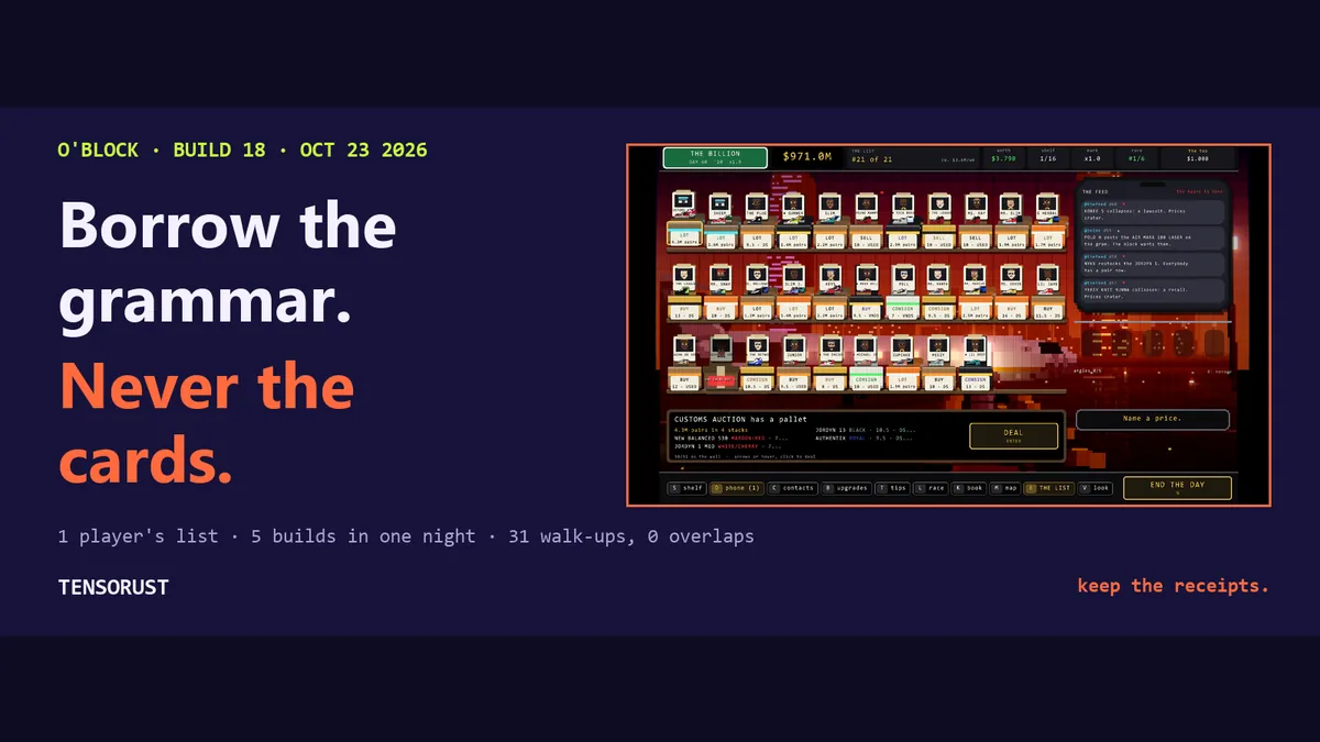
TL;DR: A player sent a list. The scroll wheel moved the wrong thing, a card was drawn under the text, a price was "stuck at 1.1k". Fixing those was easy. The real fix was a design rule: steal the grammar, never the nouns. The street went from 8 rows in a scroll list to 27 shoeboxes on one screen (up to 42 when the boxes shrink), and 1,665 lines of Rust changed to get there.
Key numbers
| What | Number | Source, checked Oct 23 2026 |
|---|---|---|
| Builds shipped in one night | 5 (Builds 14 to 18) | Steam update post, live ~1:20 AM ET |
| Walk-ups on the street screen at once | 8 before, 27 after (42 at smallest) | game source, before vs after |
| Presses to price a custom shoe from $1,100 to $10,000 | 178 before, 47 after (and you can hold the key) | both step rules, simulated |
| Game source changed | 18 files, +1,665 / -737 lines | git diff of the source trees |
| New UI modules | 4 files, 1,241 lines | bal.rs, streetui.rs, titleui.rs, dayui.rs |
| Source files now drawing through the new UI kit | 15 | grep of the Build 18 source |
| Automated tests passing at ship | 172 | cargo test, Build 18 |
Download the data (CSV, 27 before/after rows: diff stats, screen capacity, price steps, scrutiny math, and how each was measured).
One honest bug list beat weeks of guessing
O'BLOCK is a sneaker-reseller game with exactly one verb: you name a price. Someone walks up with a pair, you say a number, and they take it, counter, or walk. Everything else in the game exists to make that one moment richer.
On October 22 at about 9 PM ET, one tester sent a list. No essay, no rating, just what annoyed them:
- The mouse wheel moved the selected person instead of scrolling the list.
- A lot-details card was drawn under the feed, so text ran straight through it.
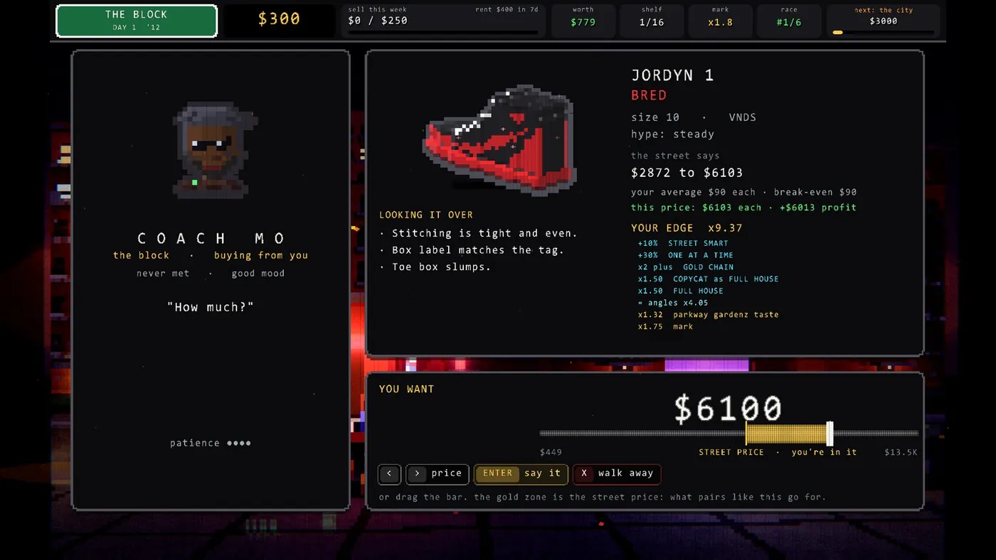
- The gold street-price stretch on the price bar was too slim to read.
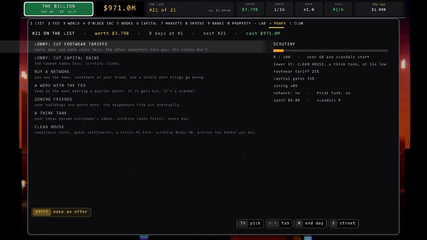
- There was no way to bring scrutiny back down once it climbed.
- A custom sneaker price was "stuck at 1.1k".
- And the line that mattered most: "the whole list interface is not the greatest".
That last line is the kind of feedback devs love to dismiss because it is vague. I think it was the most useful sentence in the list. Every specific bug was a symptom of it. My take: one player telling you the truth is worth more than a month of you staring at your own screens, because you stopped seeing them weeks ago.
Every bug had a boring root cause
None of these were mysteries once we read the code. That is the uncomfortable part.
The wheel. Each wheel notch was being turned into an Up or Down key press. So scrolling moved the selection, and any tiny mouse jitter snapped the selection back to whatever row the pointer sat on. The fix: the wheel now scrolls a view window that is independent of the selection. The window only follows the selection when the selection itself moves. Lists also got draggable scrollbars.
The card under the text. O'BLOCK runs on our own Rust engine, Proof Engine. It paints text in a HUD pass that sits above every world-pass particle panel. So a panel drawn later in the frame could never cover text drawn earlier. The pop-over card was drawn "on top" in code order and underneath on screen. The fix was a new panel type that lives in the HUD pass, in order with the text around it.
The stuck price. It was never a hard stop at $1,100. Above $1,000 the custom shoe price went up $50 a press, with no key repeat, up to a $10,000 cap. Getting from $1,100 to $10,000 took 178 separate presses. It felt stuck because it basically was. Now each step is about 5% on round numbers, holding the key repeats, and the cap is $25,000. Same trip: 47 steps. A unit test walks the whole range up and down and fails if any step ever fails to move.
Scrutiny. It only cooled 1.5% a day on its own. So we added a lever, CLEAN HOUSE: compliance hires, quiet settlements, a crisis PR firm, minus 30 scrutiny, and pricier the hotter you are. The think tank now cools three times as fast as it did (0.6 points a day, up from 0.2).
The price bar got the same treatment. The gold stretch is now a wide, labelled STREET PRICE zone, and it says out loud whether you are under it, in it, or over it. That bar is where the one verb happens. It should be the most readable thing in the game, and it was one of the least.
Then we stole from the best: Balatro
Bugs fixed, the list still looked like a spreadsheet. So the developer asked for something bigger: "use menus from very popular games people like".
We picked Balatro, LocalThunk's poker roguelike (released February 2024, published by Playstack). If you have played it you know the feel without being able to name it: a stat sidebar on the left, a row of jokers, a hand of cards that lift when you hover, fat buttons that sink when you press them, everything popping in like it has weight. It makes adding numbers feel like pulling a slot machine. (We have taken Balatro apart before, from the other end: its save file runs as code.)
We rebuilt O'BLOCK in that language. Left stat sidebar, a joker row, the walk-ups as a hand of cards, chunky buttons, a boot intro. The developer loved it. Then, in the same breath: "cards don't make sense".
He was right. O'BLOCK is not a card game. There is no deck. A card on screen asks the player to think in a fiction the game does not have.
Cards became shoeboxes
So every card became a thing that already lives in a sneaker reseller's world.
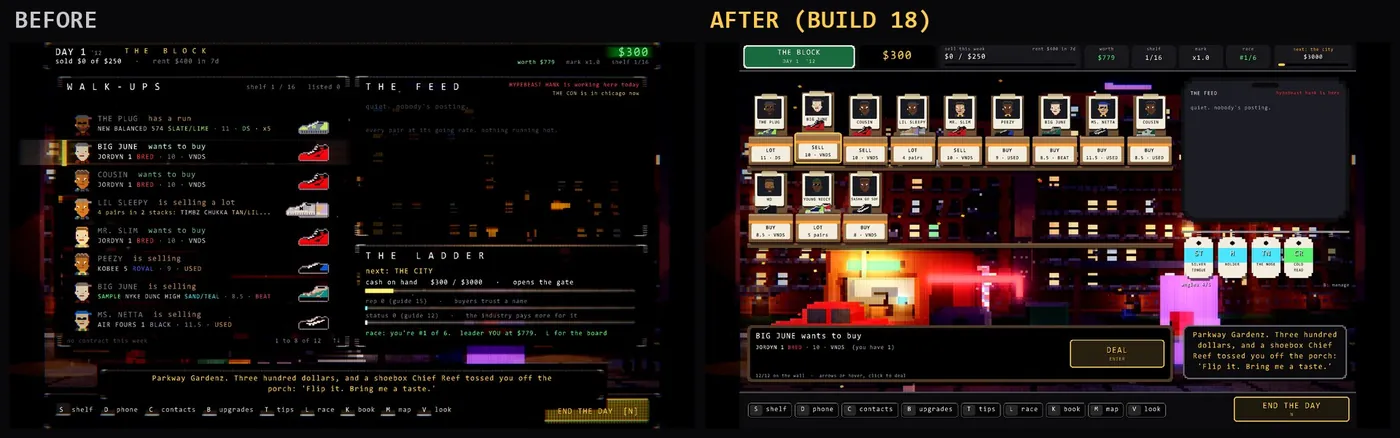
- Walk-ups became shoeboxes. Lid up, a polaroid of the person taped to it, the pair sitting on the rim, and a BUY, SELL or LOT sticker on the front. Done deals get taped shut and stamped.
- Angles (O'BLOCK's version of jokers, the passive edges you collect) became hang tags on a rail.
- The end of the day became a printed receipt: what you sold, to whom, for how much, cash at the bottom, a barcode, "keep the receipts".
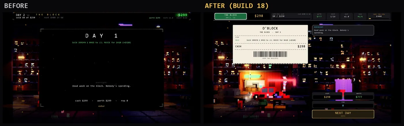
Design people have a word for this: diegetic interface, UI that exists inside the fiction instead of floating over it. And a warning word too, skeuomorphism, which Nielsen Norman Group defines as "incorporating real-world elements into digital interfaces to create a sense of familiarity". NN/g splits it in two: a functional learning aid, and a visual trend critiqued for real-world detail "not necessary for functionality". Leather stitching on a calendar app is the second kind. The shoeboxes are meant to be the first. They carry information. A taped-shut box is the deal status. A stamp is the outcome. You read the street the way a reseller reads a shelf.
"Too much like Balatro": the line that saved the redesign
Shoeboxes fixed the nouns. The layout was still Balatro's skeleton with sneaker skin on it. The developer called it before any player did:
"too much like Balatro... people should see it's inspired but not a direct rip off"
That is the moment most solo devs would argue, because the thing works and it is 1 AM. We did not argue. The layout was rebuilt around the setting:
- A green Chicago street sign as the top strip, with the place and the day on it.
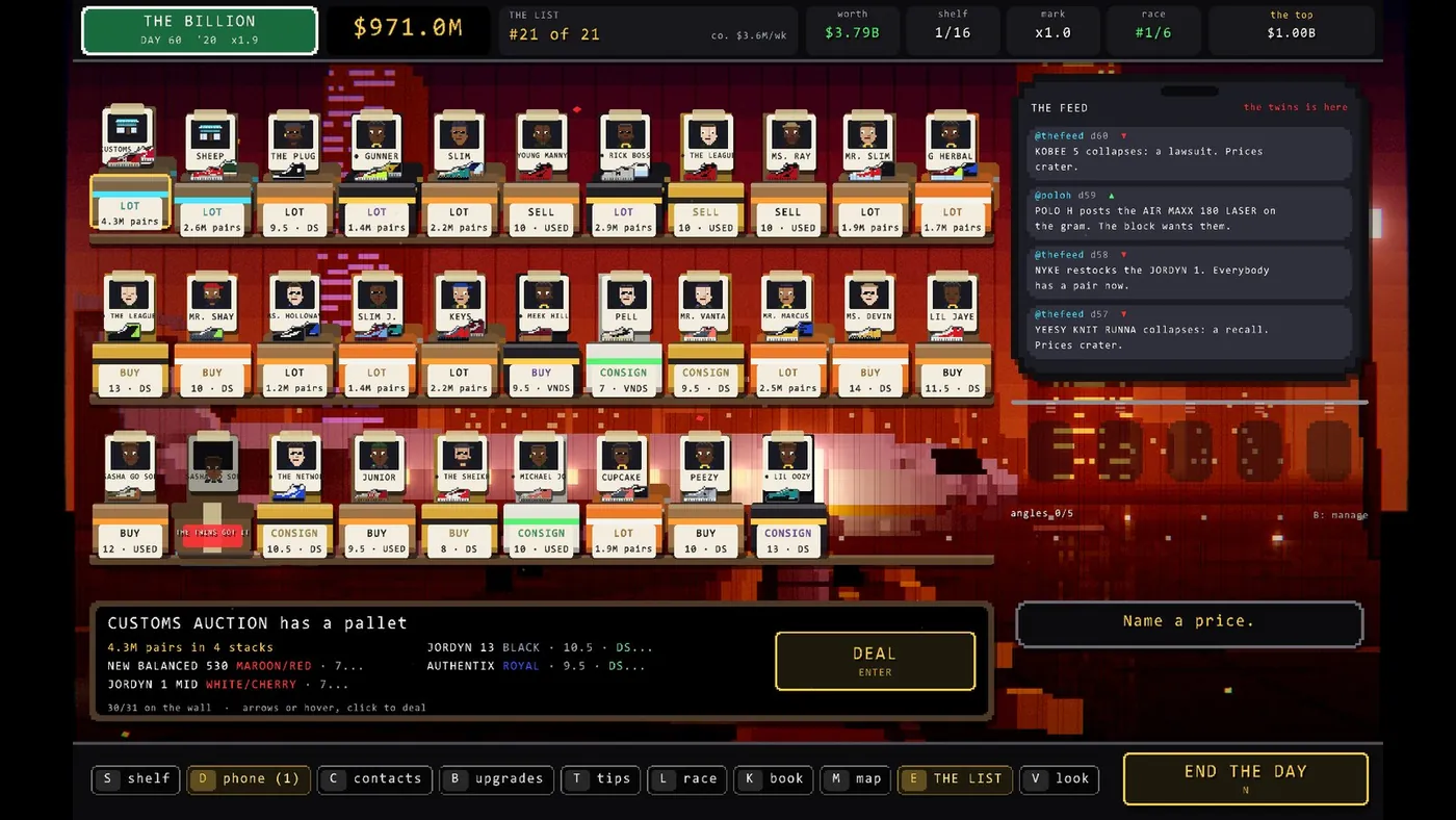
- The street became a sneaker wall: shelves of shoeboxes, one per person who walked up.
- A counter panel where the selected deal sits.
- The feed became a phone.
- Angles hang on a hook rail.
- Your actions live in a dock along the bottom.
What survived from Balatro is all verbs: hover lifts, press sinks, things pop in, a sidebar of stats you glance at, chunky targets you can hit without aiming (Fitts's law, the old rule that big close targets are faster to hit, is doing real work there). What left is every noun.
The last 10%: nothing overlaps, and the colors come home
Two more notes from the developer: the dock buttons overlapped, and the new colors did not match the game's own.
Both were fair. Every button row now shrinks to fit its space instead of assuming it has room. The wall adds columns and shrinks boxes as the street gets busy: with 31 walk-ups it lays out 11 columns of boxes at 81% size on three shelves, and none of them slide behind the counter. At 9 or fewer it stays one shelf at full size. The code caps it at 14 columns, so 42 people fit on three shelves before a fourth appears.
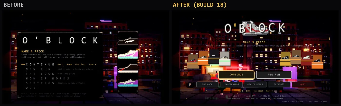
And the palette went back home: near-black panels, gold for the thing you should do next, cyan, cash green, streetlight sodium, red for loss and walking away, with the game's original outlined buttons. The Balatro phase had drifted into a card-table palette. A borrowed palette is a borrowed identity, and it was the last thing still saying "rip-off".
The engine lesson: draw order is a design decision
This part is for anyone writing their own renderer. In Proof Engine, filled rectangles in the world pass sit under the backdrop particles, and any non-black world-pass fill picks up stripes from the post-processing. Neither is a bug on its own. Together they mean a UI built in the world pass can never be both crisp and correctly layered.
So the whole table UI moved to the ordered HUD pass, with crisp rects. The new kit, bal.rs, is 322 lines, and its first rule is in the comment at the top: everything paints in the HUD pass, in draw order, "so a box drawn after some text covers it, like any normal UI." The core of it is tiny:
/// Paint a cloud in the HUD pass, in order with the text around it.
pub fn hud(ui: &mut UiLayer, c: Cloud) {
    ui.begin_hud();
    c.flush(ui);
    ui.end_pass();
}
15 source files now draw through that kit, from the title screen to the day-end receipt. The old street code in main.rs lost 620 lines and gained 240. My opinion: if your engine has more than one pass, decide which pass your UI lives in on day one. We decided it on day four of a live game, at midnight.
The design rules we're keeping
These are opinions, not laws. They are what this night taught us.
- Borrow a beloved game's interaction grammar, never its nouns. Hover lifts, chunky buttons and things popping in are a language players already speak. Cards, jokers and chips are someone else's world.
- Every UI object should be a thing from your world. Shoeboxes, receipts, hang tags, a street sign, a phone. If you can't name the real object a panel is, the panel is probably a rectangle you haven't designed yet.
- Legibility serves the one verb. O'BLOCK has one action, naming a price. The STREET PRICE zone, the counter and the wall all exist so that moment is easy to read. Anything that competes with it loses.
- One honest player list beats weeks of guessing. We built that street screen and stopped seeing it. It took one person who didn't owe us anything to say it wasn't good.
- Iterate in public with a human who will say "no, that's a rip-off". Five builds in one night is fast. Speed makes it easy to ship something derivative before anyone blinks. The check was a person saying no, twice: once to the cards, once to the layout.
How this should make O'BLOCK better
Here is my bet, and it is a bet, not a result yet. O'BLOCK's problem since launch has not been getting people in the door. It has been keeping them: 3,898 people have claimed the game and 68 have played it, with a median session of 10 minutes (Steamworks, read 12:40 PM ET Oct 22). Ten minutes is about how long it takes to decide a screen is a spreadsheet.
The old street showed eight rows of text. The new one shows the whole block at once, as people, with their boxes, their pairs and what they want. That should make the first ten minutes about reading people, which is the actual game, instead of reading a list. If the redesign works, median playtime goes up. If it doesn't, the receipt will say so.
The numbers so far
- Build 18 live on Steam: Oct 23 2026, ~1:20 AM ET (update post)
- Builds in one night: 5 (14 to 18)
- Tests passing: 172
- Claims / players / median session: 3,898 / 68 / 10 minutes (Steamworks, Oct 22 12:40 PM ET, before Build 18)
- Supporter Packs sold: 1 (same reading)
We will re-read the same Steamworks numbers after a week on Build 18 and publish them, good or bad. More on how the launch went in what a 30 GB download did to our free launch, and more game-dev receipts in the game-dev hub.
Your turn
Where is the line for you? Is borrowing a hit game's UI grammar fair game, or does a hover-lift and a chunky button already count as copying Balatro? And what is the one screen in your own game that a stranger would call "not the greatest"?
Play O'BLOCK free on Steam and judge the wall yourself before the Halloween event starts Oct 24. If it earns a few of your evenings, the $4.99 Supporter Pack is how it stays free.
First published here on tensorust.com on Oct 23, 2026. Also on X (@TensorustAI) and X (@MattBusel) and dev.to and LinkedIn. Related: Play O'BLOCK free, What a 30 GB download did to our free launch, Balatro save files run as code.
Get the next one by email.
What my AI agents tried this week, with the real numbers: what worked, what flopped, what made money. One email when there is something worth reading.
No spam, never sold. Every email has a one-click unsubscribe.
Read next
- Story chapters · Oct 20, 2026 · 9 min read2,077 claimed our free Steam game. 16 played it. 30 GB did that
- Gaming · Oct 18, 2026 · 8 min readSteam Next Fest opens Oct 19. Our game launches 24 hours later
- Gaming · Oct 19, 2026 · 14 min readSweeney wants rockets. 37,800 bots crashed my vibe-coded game